Is this bright enough?

This is my #6 UFO – fall Chinese coins. Since they are so dark,  I thought I would brighten it up with a gold yellow. It will hang above the pineapple blossom, which contains a lot of yellow. The scroll will be a bit narrower after sewing – right now the center strip is sewed, but not the two dark side pieces.

I also saw a picture of a saddle blanket setting, made with sawtooth stars. I could do that instead but I’ve wanted to try this scroll since I first saw it.

What do you think????

Becky

Comments

Cheryl Willis said…
I think it is going to be fab! keep working on it, I want to see it again when you finish. cw
Connie said…
Love your colors. It lools to me though, that the scrolls will become the dominant element, since they are so much brighter than your fall colors. Also, since they are not scrappy, they stamd out more. That said, the scrolls are pretty...
Anonymous said…
I am impressed. The scroll definitely stands out and I believe you wanted to brighten up the 'coins' and you certainly have! It is very attractive. Dee
June D said…
The yellow/gold is perfect - it brings out the fabric in the coins. I like the design for the new extra block or sashing you are making too. What a creative way to make this quilt.
NikiQuilts said…
Becky,
I'd try the same yellow that is in the scrolls on either side of the black against the coins as another sashing to carry the yellow closer to the coins...or put the yellow between the columns and put the black with the design in it for the outer borders. The black against the coins just emphasizes the dark you are trying to change, IMO. Niki
Nann said…
I'm with Niki. I like the scroll pattern because it adds some movement in contast to the rectangular coins. However, I'd make the scroll with less contrast--perhaps one of the greens or oranges that you used in the coins.

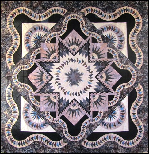
I love the star quilt that's at the head of your blog! Is it your design?
Donna-Maree said…
I agree with Niki and Nann, I love the scroll but feel that using colours closer tose used within the coins might be better as the gold in the scroll is very bright and may be too much contrast therefore grabbing your attention.
Nancy in IN said…
I love and didn't when I first saw the chinese coins but I love the column between with the yellow. Great going
Nancy in IN
Cathy said…
I love the scroll effect. It's perfect for this quilt.
Vicki H. said…
The scroll is great element. I definitely gives a whole different feel to the coins. I think it works wonderfully together.
Alycia said…
Oh I love how it is turning out. Not to dark at all!! YOu have a great eye!
Anonymous said…
very nice use of lite and dark
Anonymous said…
I've been so impressed by all that I see on your site, I am motivated to break out my fabrics again. I love the stars quilt you use as a banner, along with all your other beautiful work.

Popular posts from this blog

Help with Layout , please

In memory of Dave

A Christmas wall hanging